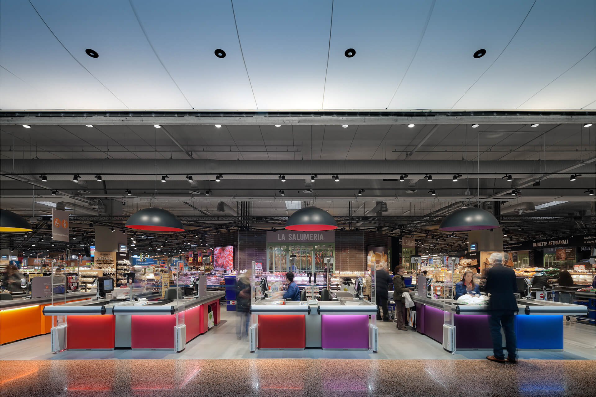
A novel design response to a common problem: the increasingly lesser appeal of large hypermarkets, particularly in relation to the contexts in which they are inserted.
Field
Food
Client
Carrefour Italia
Location
Carosello shopping center,
Carugate, Milan,
Italy
Opening
December 2015
Type
Updating and reconfiguration of spaces
Gross surface area
12.000 sqm.
Architect
Paolo Lucchetta
Architects/Designers
Fabio Pacquola
Category
Architecture
Interior Design concept
Photos by
Marco Zanta
Carrefour Carugate is one of the largest Italian hypermarkets. The starting point of the project was as follows: the shopping center in which the hypermarket is located – the Carosello in Carugate, Milan – attracted 8 million visitors a year, of which only 20% entered the hypermarket. After all, if you think about it, everyone happens to go to a mall to make purchases but, basically, the last thing you want to do while walking in the gallery is to go past the “famous” barrier of a super / hypermarket, because it is, in fact, a barrier, an uninviting border that delimits a space that is scarcely appealing if it is related to the rest of the shopping center. It is an almost language topic: “Doctor Jekyll and Mister Hyde”; that is, the spatial quality of the galleries is generally much higher than that of the hypermarket.
The basic objective of the project was very simple: if we bring this 20% of visitors —of a 100% who is already inside the building, is already dropped from his car, is already willing to purchase- at 40%, we double the turnover. But how?
The solution, in our opinion, was to eliminate the difference in tone of voice between the gallery space and the hypermarket space.
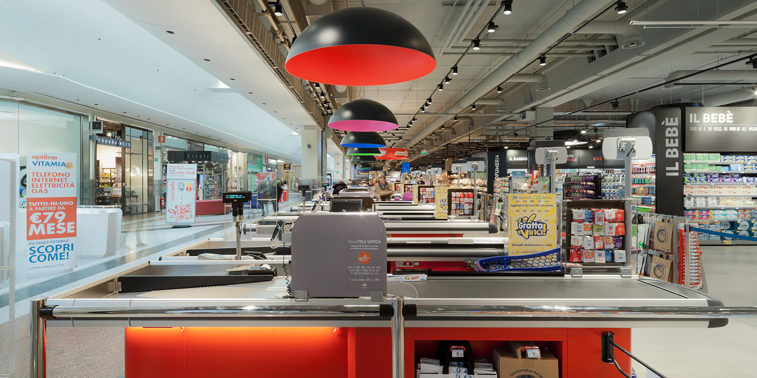
The project proposal was to completely reverse the sense of barrier, of obstacle, adopting uncommon solutions for a space of this type: we colored the cash registers with a wide range of colors; we then placed a light source exclusively on the cash point through large colored caps (a series of giant lampshades), eliminated the chromatic value of the white of the systems ceiling, canceled the diffused light and brought only a scenographic light; therefore, using a tone of voice equal to that of the gallery.
We therefore created a sort of fusion between the space of the gallery and the numerous shops that overlook it and that of the hypermarket.
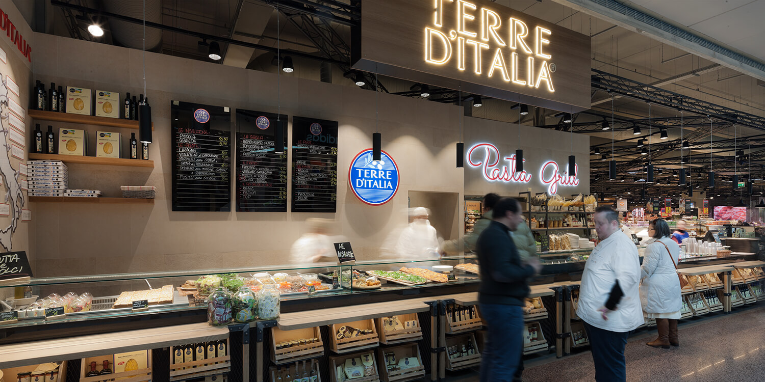
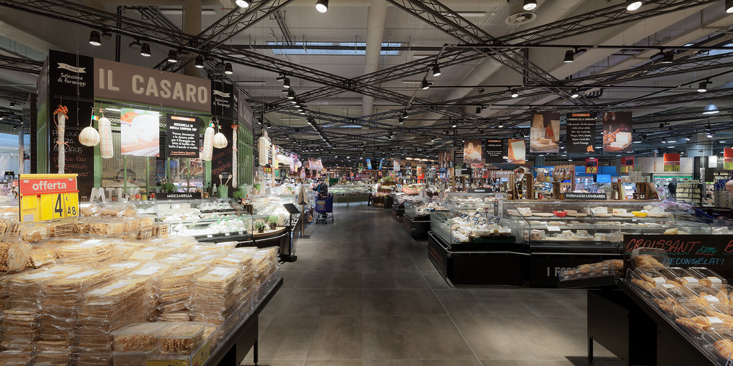
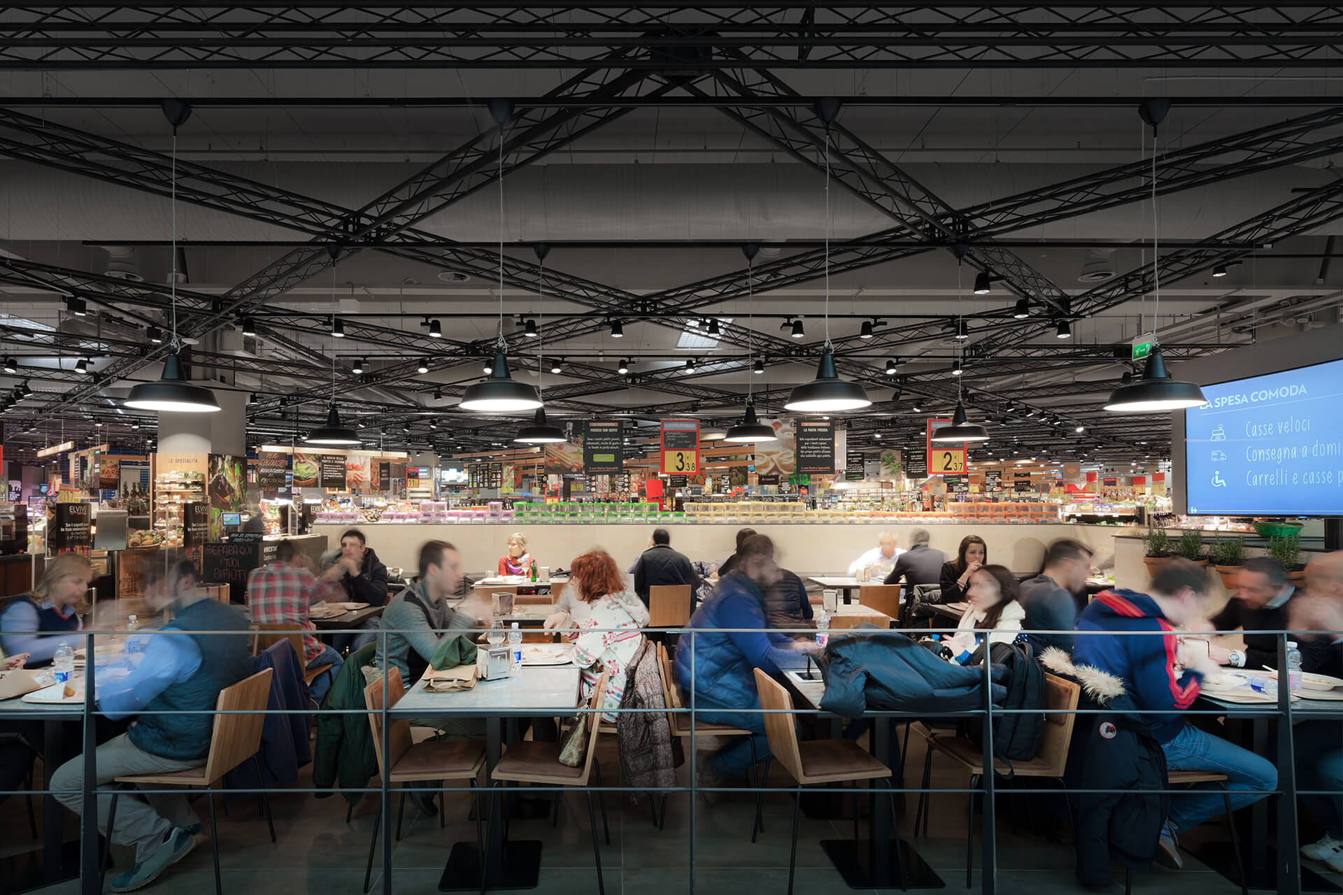
This change of language, sometimes even subtly accentuated if compared to some shops in the gallery, meant that this solicitation was answered.
There was an increase in the number of entries, also due to a reduction of the sales surface and greater specialization of the spaces, such as, for example, the inclusion of restaurants. The increase in admissions has meant that the hypermarket, despite going from 18,000 to 12,000 square meters, has increased its turnover.
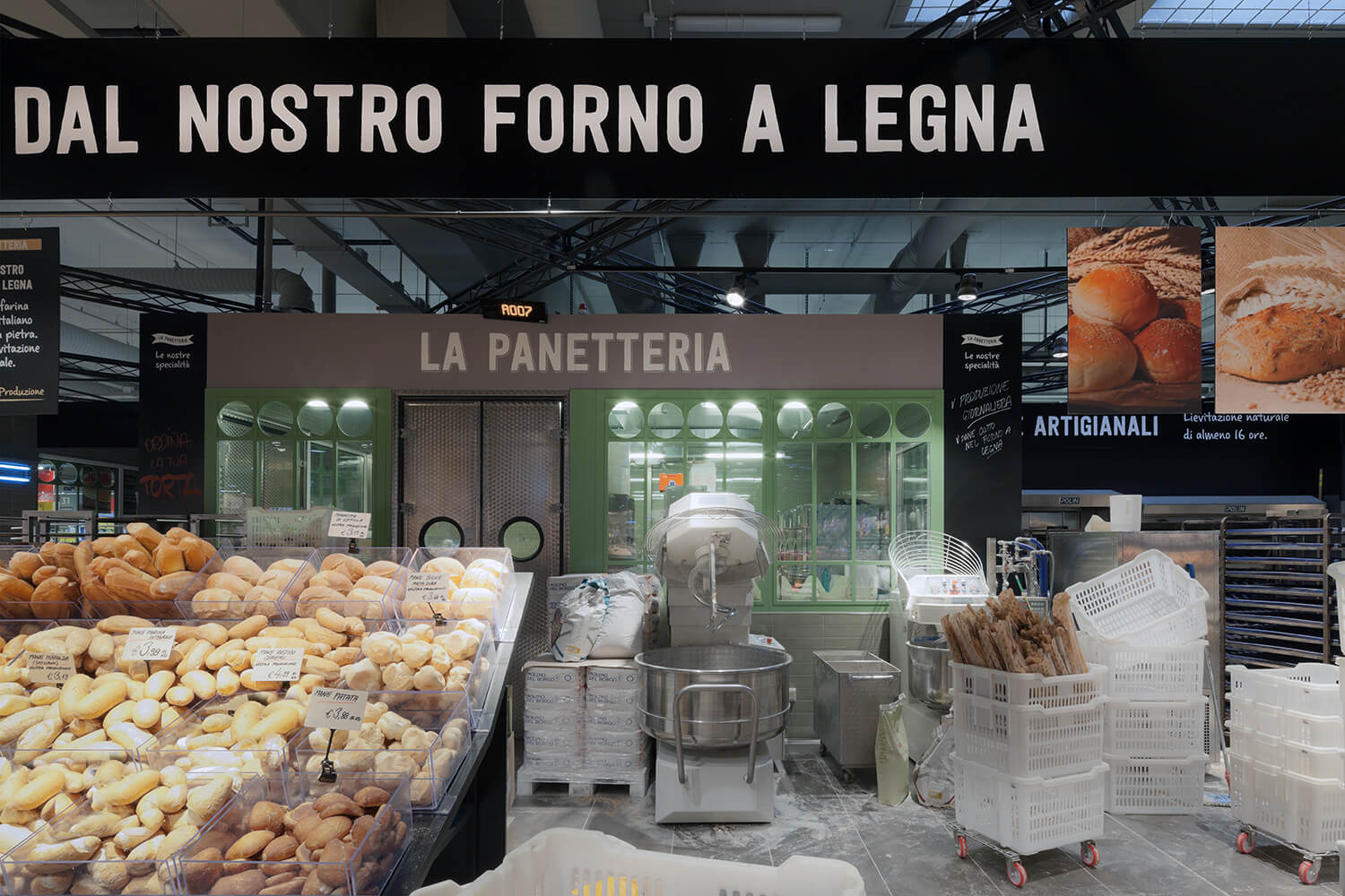
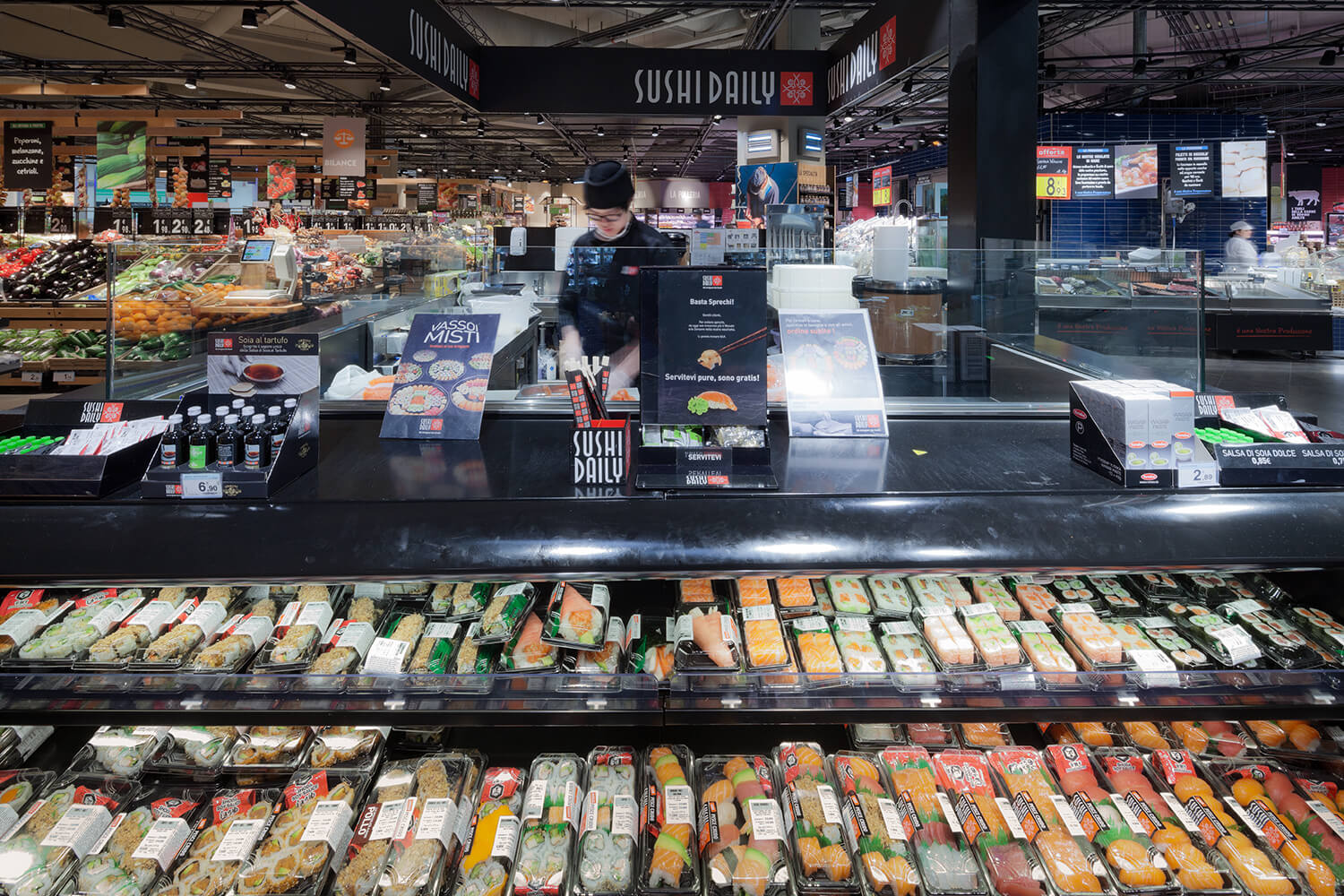
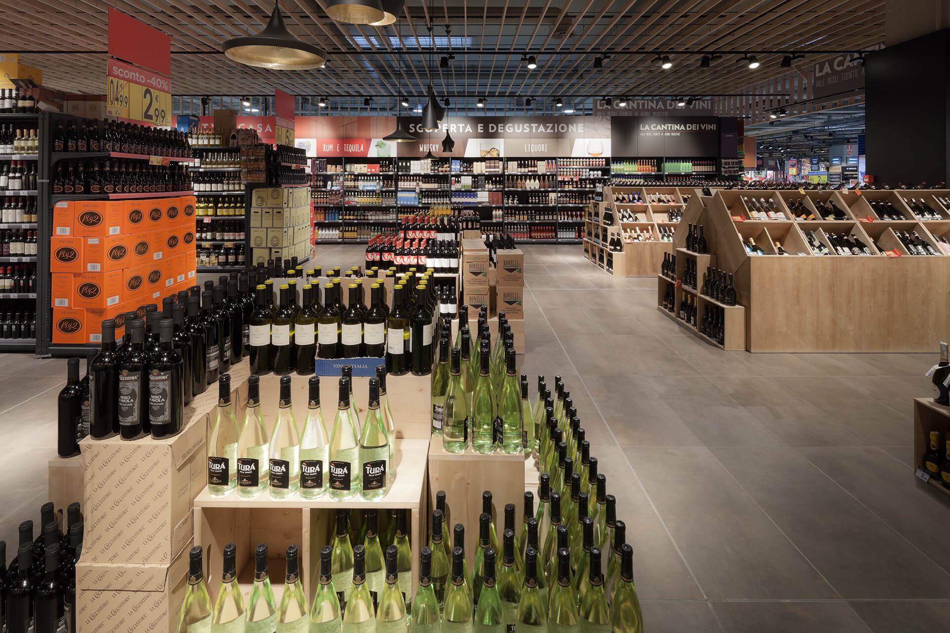
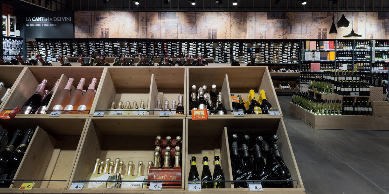
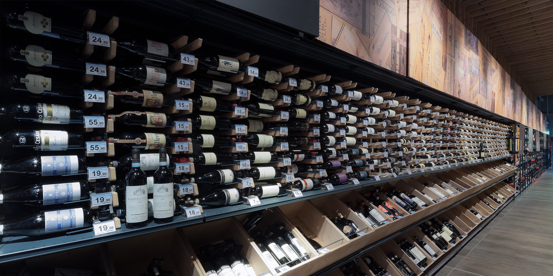
This change of language, sometimes even subtly accentuated if compared to some shops in the gallery, meant that this solicitation was answered.
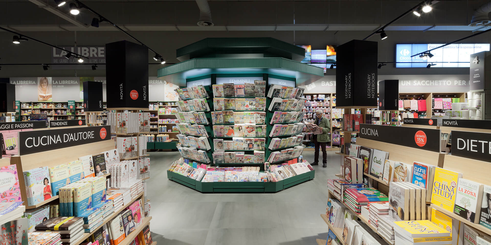
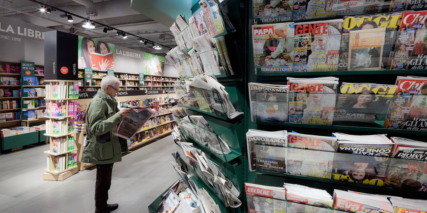
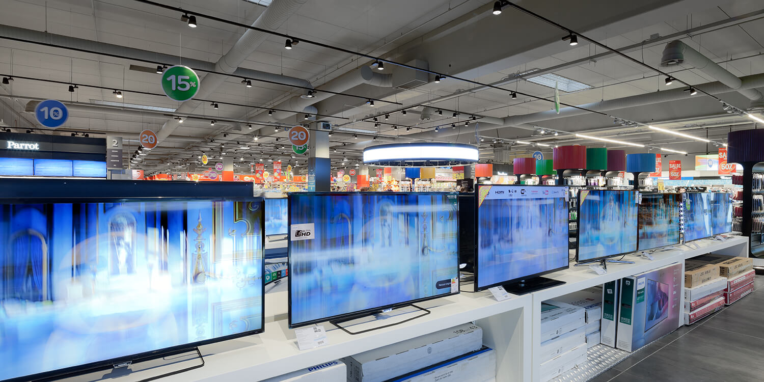
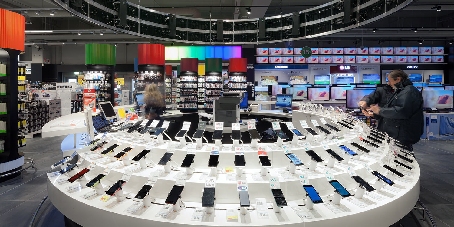
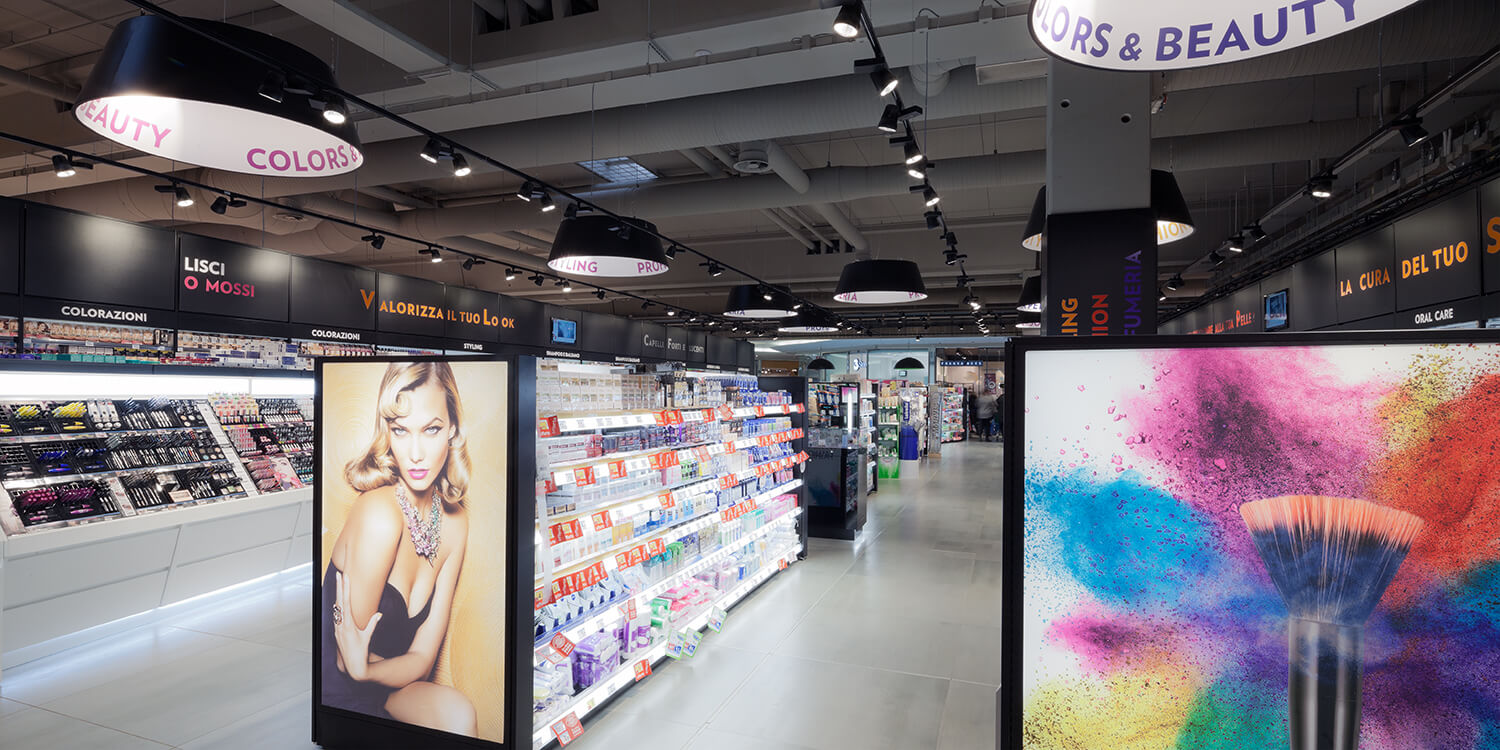
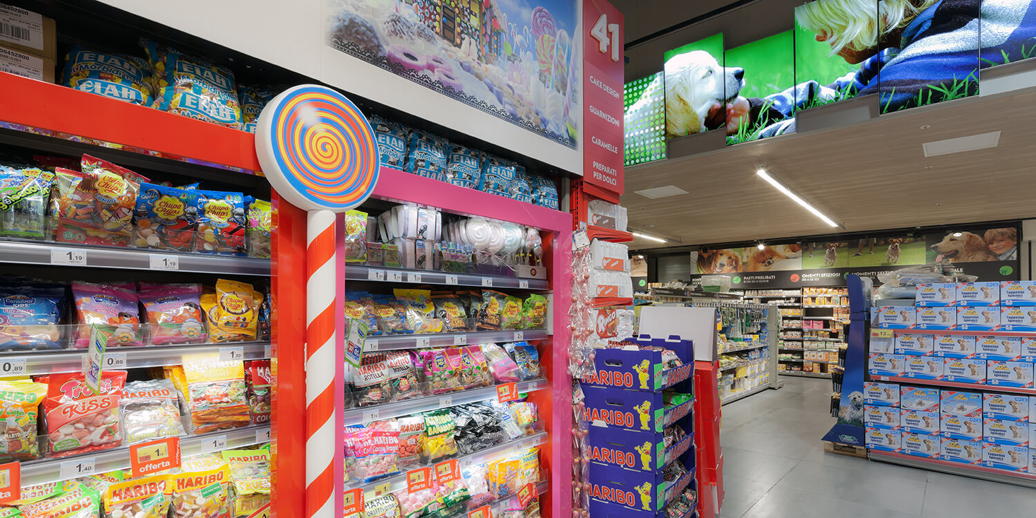
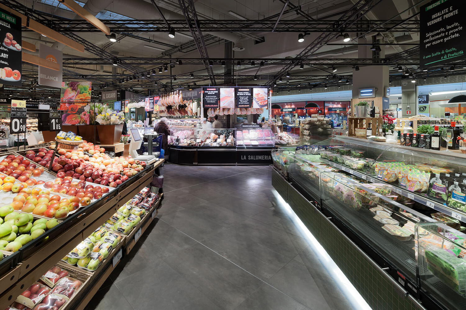
In the case of Carrefour Carugate, our “therapy”, the added value of our work, has resulted in a change in the perception of spaces: totally changing not the layout, in this case, but the tone of voice with which Carrefour expresses itself within this context, also through a re-design of the display systems, the insertion of large information monitor walls, large spaces of interaction on the theme of telephony, cash points completely open without avant-garde or with very low avantgarde, spaces dedicated to perfumery with semantic values, also here, linked to the imagery associated with it, expressed through the use of black and luminous surfaces; spaces characterized by formal elements linked to the world of food, newspaper kiosks, laboratories for the preparation of food on sight, bakeries, the “cellar” with large wine catalogs.
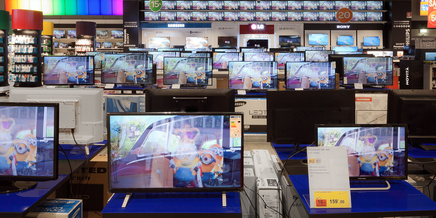
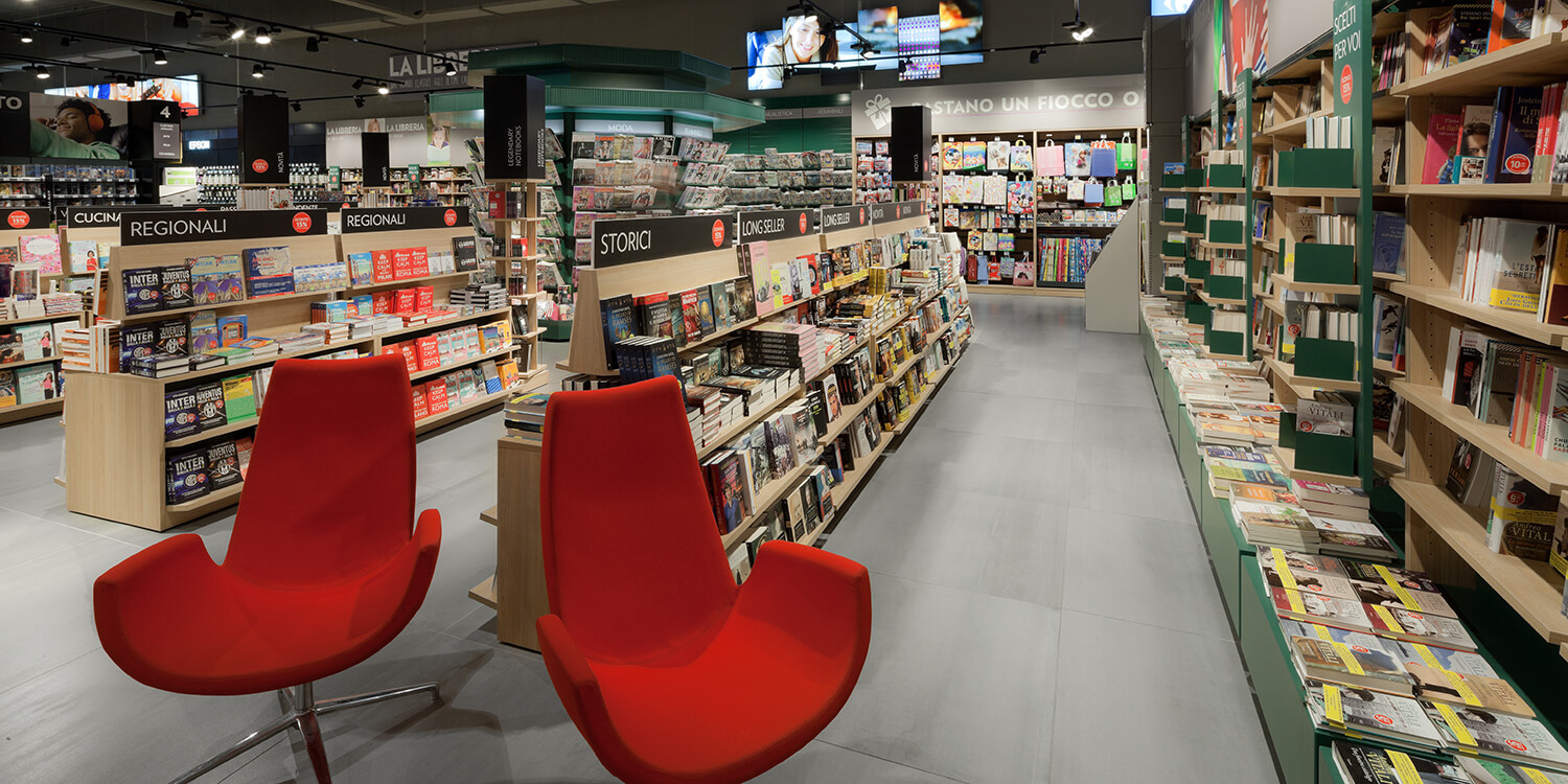
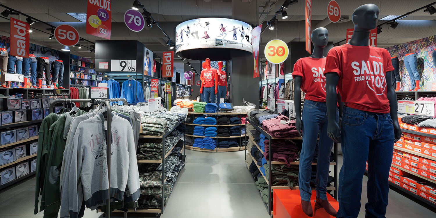
A design response to a field —that of large retailers— in great transformation, the result of a methodology aimed at discovering the essence of things, the soul of spaces and products, to understand what are the things that make sense for the customers.


