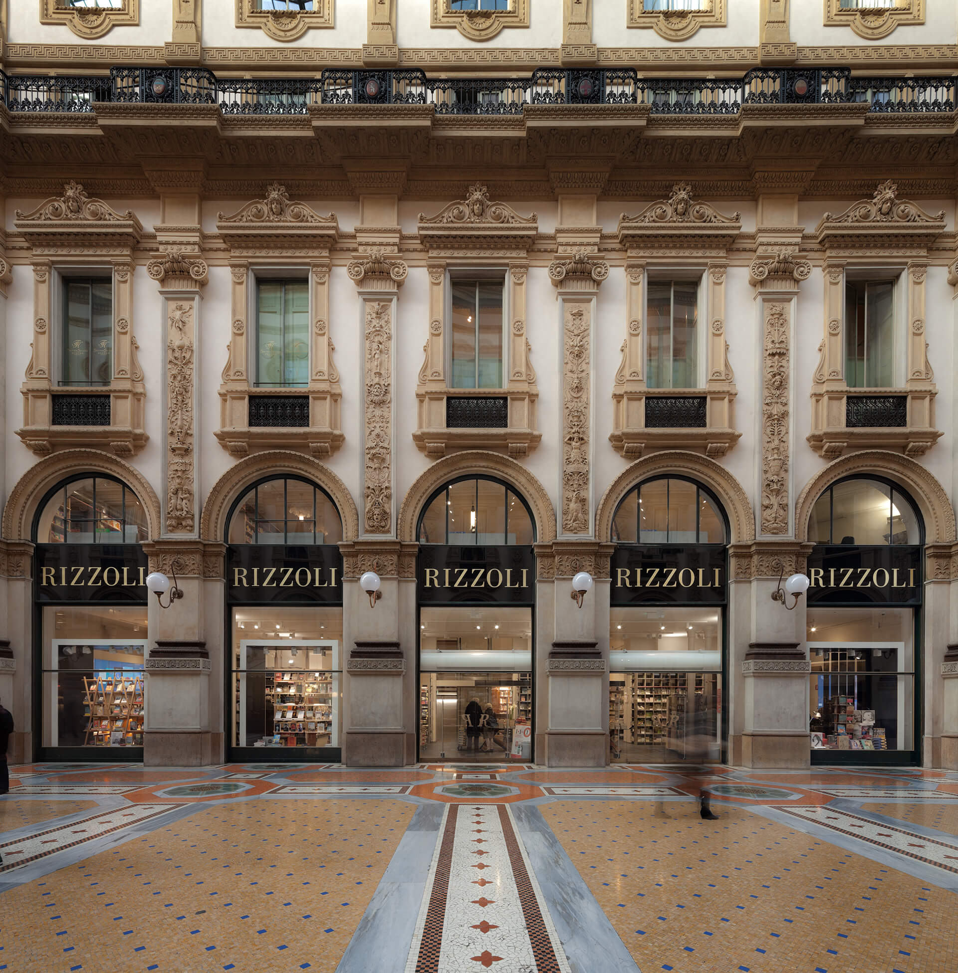
Rizzoli Galleria: the reinterpretation of the architectural spaces, the Rooms of the Book and the Design for Reading.
Field
Arts & Culture
Client
RCS spa
Location
Galleria Vittorio
Emanuele II, Milan,
Italy
Opening
November 2014
Type of intervention
Update and re-arrangement
of the spaces
Gross surface area
1058 sqm.
Architect
Paolo Lucchetta
Architets/Designers
Michele Marchiori
Silvia Ferrari
Vanessa Filippetto
Giovanna Fanello
Main contractor
Essequattro spa
With
Project Informatica srl
(multimedia systems design)
Suppliers
Reggiani spa (lighting); Skema (pavimenti); Moormann, Cassina, Vitra (arredi speciali); Universal Selecta (scala); Maspero Elevatori (ascensore); Erregi (impianti elettrici); Edilpietro (opere civili)
Category
Architecture
Interior Design concept
Photos by
Marco Zanta
It is nice to think that redesigning the Rizzoli bookstore in the Galleria Vittorio Emanuele in Milan is not an issue solely related to architecture. It is mainly about all the questions related to the aesthetic of relationships: trajectories of signs between places, things and people. People meet in architecture and in this respect bookshops are architecture, assuming a unique and distinctive meaning, being contemporary also nowadays, in the digital age.
“The Rizzoli bookshops are unique. They are places of passion for the arts and for bookselling, with a particular attention to details, offering booklovers quality products and services in a welcoming environment, with a huge selection of books displayed with style and at the same time a generous supply of charm, passion, creativity and variety”.
Today more than ever, the identity of business places is mainly based on what can be discovered rather than seen. The majority of the latest set-ups remind us images already seen. What is less evident, that is details, preserve something of the special nature of the places, made of relations rather than of space itself. This is the original and distinctive element of the Rizzoli bookshops.
The Rizzoli bookshops cannot be related to generic formats or luxury flagship stores. They are uncomparable places in the booklovers’ global imagery. As described in a catalogue of Rizzoli Bookstores few years ago: “The Rizzoli bookshops are unique. They are places of passion for the arts and for bookselling, with a particular attention to details, offering booklovers quality products and services in a welcoming environment, with a huge selection of books displayed with style and at the same time a generous supply of charm, passion, creativity and variety”.
The real challenge and ambition of the project has been being able to see and tell the distinctiveness of the reading experience.
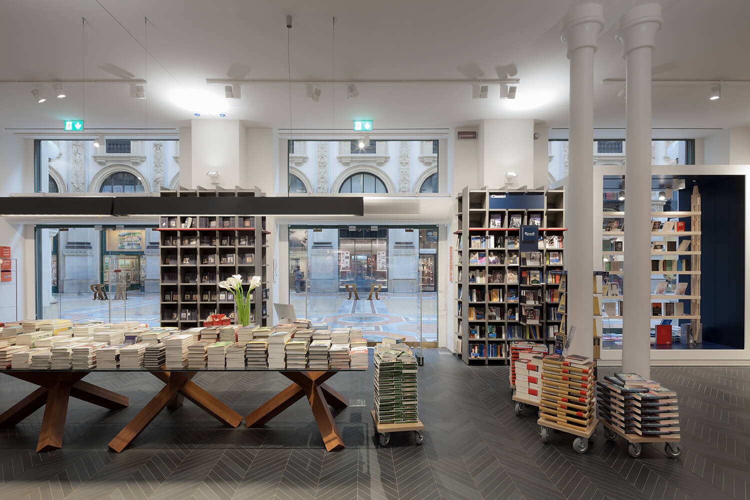
Since the first draft, the attention to details has inspired most of the choices including new and old material suggestions. The main steps have been the re-polishing of the “R” shaped brass handles, the finishing of the walls in a particular shade of white, recommended by the superintendent for the restoration of the plaster façade of the gallery.
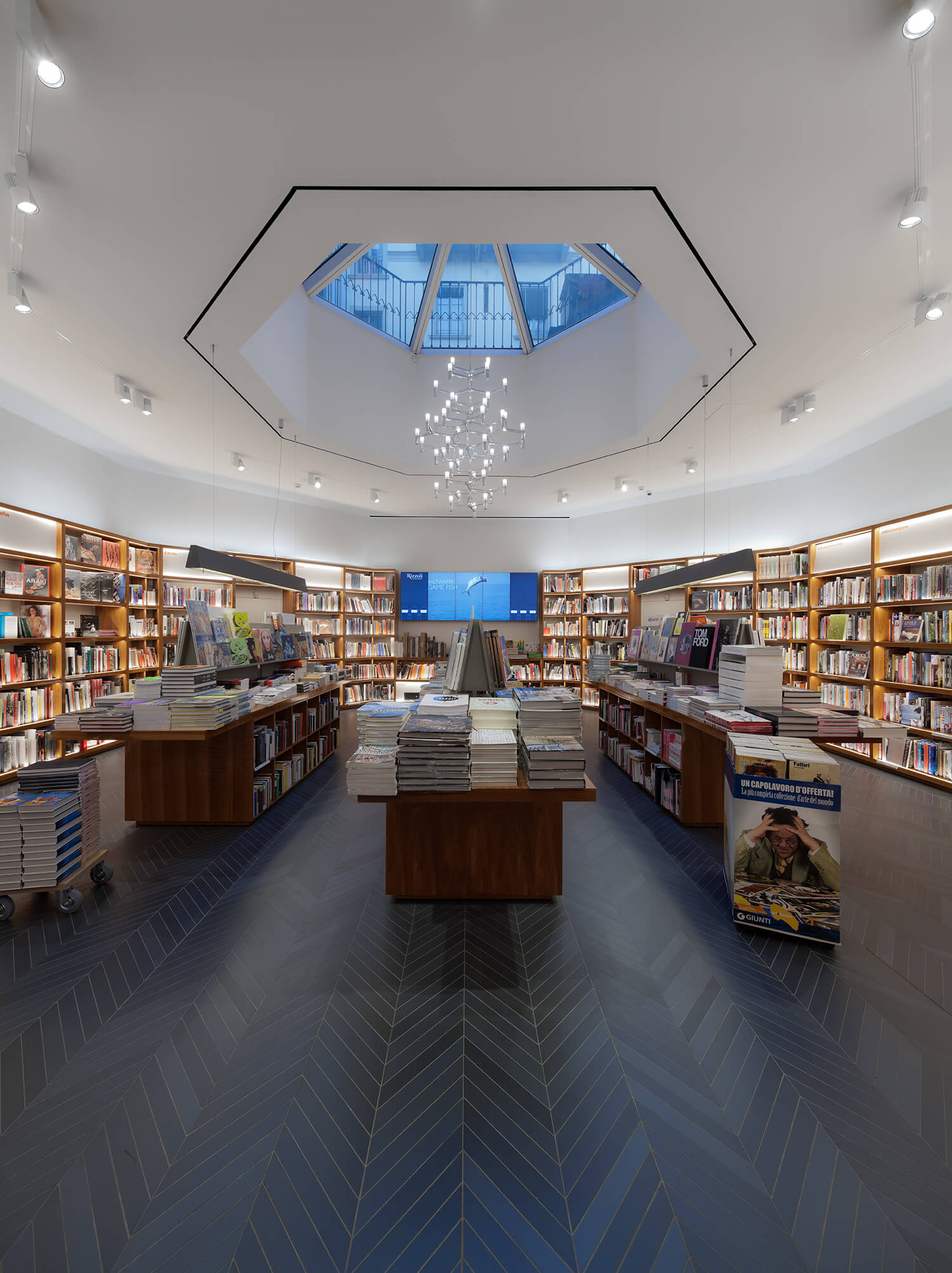
The choice of the “blue ink” color for the ceramic flooring, laid according to the Chevron patterns of the French libraries, the American cherry wood furniture-bookcase of the Rizzoli Building on Fifth Avenue and West 57th Street, and more. All the elements of the project have been inspired by nostalgia, quotes, and at the same time by new perspectives and contemporary scenarios.
Retail is considered a continually evolving field in which the use of each space is consumed quickly. This causes a slow obsolescence in which the suspension of time positions the places in a stasis. In this place, some values are kept intact, and others show unexpected potentialities.
The 1877 building by Giuseppe Mengoni has experienced different stages until the renovation in 1999. The feeling of the potentialities for the reinterpretation of the architecture guided all the choices concerning the historical building. It has been essential to consider the functional adaptation of the space, but with the constant attention to maintain the uniqueness of the place.
In the shops of the gallery, the decorative elements of the architecture are not the only dominant nature. The proportions and articulations of the interior spaces are more significant: the large glass windows highlighted by arches and vaults, the width of the basement that equals to the arm of the gallery, the domestic courts of the first floor, the geometrical empty spaces. All of these elements are the compositional emblem of the entire project by Mengoni.
The theme of the discovery and exploitation of innovative spaces corresponds to the nature of the city of Milan: it expresses itself was expressed more in what it hid under rather than what it showed. To the facades of the historical buildings, the city opposed a “behind the scenes” of its own. It was not the individual building to count but the quality spread through the discovery of the hidden beauty of its courts, the geometrical empty spaces in which the collective nature was strengthened.
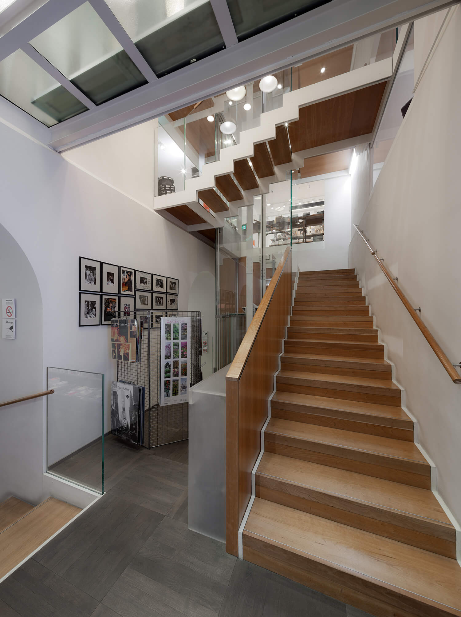
In addition to the intention of reinterpreting and enhancing the spatial relationships of the original building, the project includes an insert of new architecture consisting of a pedestrian scale and a lift, designed using the latest technologies in order to minimize the visibility of the structure and ensure a greater transparency using clearer glasses.
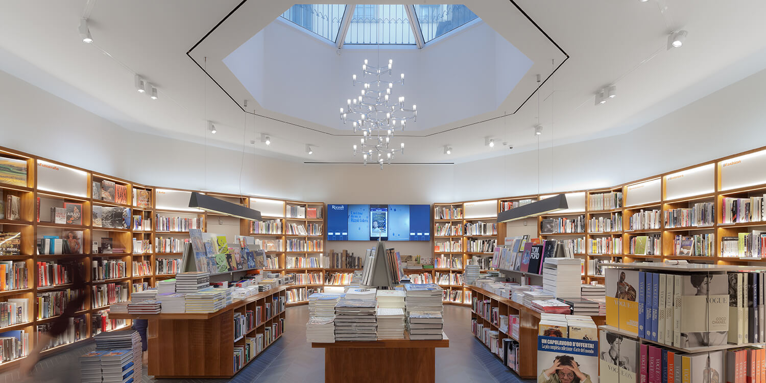
The core of the project, the al location of the space, consists of the vertical communication between the floors and of the vision of innovative perspectives within architecture. Furthermore, Rooms of the Book have been gathered from architecture. In these Rooms a selection of books divided into thematic areas can be found, in order to let the readers discover the details and the values of the books properly.
Beyond the space issues, the real core of the project lies in the design for reading. In Milan, an extraordinary generation of designers has dedicated some of their best productions to the book. Some pieces have been selected and set up with new display elements designed specifically for the new Rizzoli Bookshop, as a tribute to the original and eternal value of the city. The modeling of the light has been particularly accurate in order to express the soul of the space and to highlight the expositive criteria of the Rooms of the Book. All of this has been made possible tank to the Viabizzuno’s and Ingo Maurer’s collections of lamps, and to the LED lamps by Reggiani.
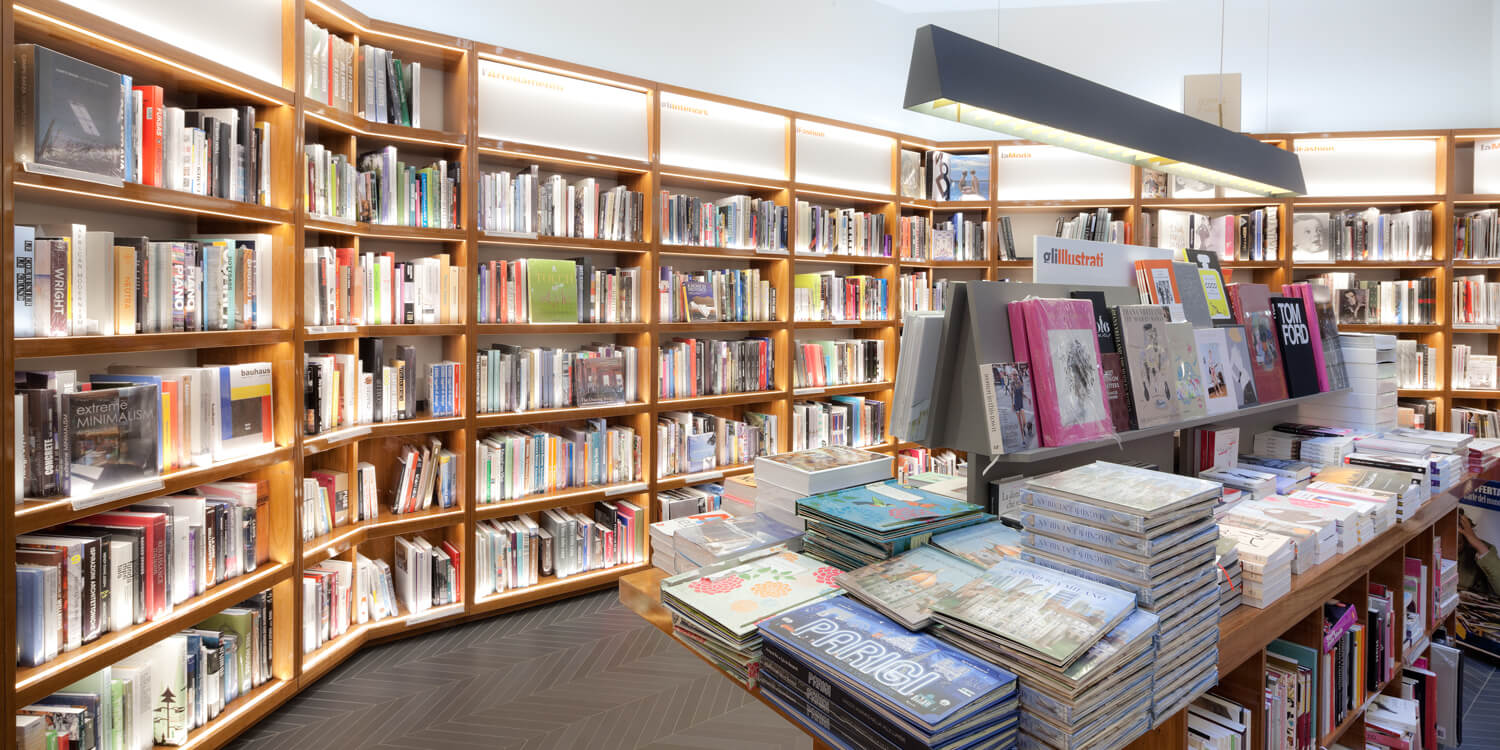
The new furniture-bookcases have been inspired above all by a long and passionate work of research and by the real comparison with the secrets of the bookseller’s trade. The bookseller is the central figure in a place where the human factor is the soul of relationships. It is a job which is rich in cultural competence and diplomatic capability, expressed through an absolutely un common talent to expose books with art. many technical solutions have been designed to allow booksellers to tell the editorial proposals in a wide range of exhibition modes. This variety can be found in the Rooms of the Book as well.
Images, words, texts, digital windows are carefully positioned within the space to accompany the experience of book lovers between information and new inspirations. There is also the possibility of using several reading stations, consultation tables and reading events.
For all these reasons, redesigning a bookstore cannot be just a stylistic exercise for an architect. Shielding places from the occasional transformation in order to consider them in their whole spectrum makes it possible to take a fresh look at the values of what surrounds us. It also allows to imagine through the projects of public spaces, where bookshops belong to indeed, a new culture of knowledge, strongly supported by its roots.
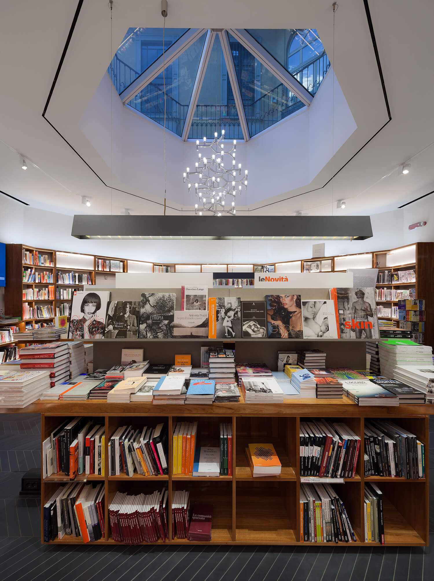
The main steps have been the re-polishing of the “R” shaped brass handles, the finishing of the walls in a particular shade of white, recommended by the superintendent for the restoration of the plaster façade of the gallery.

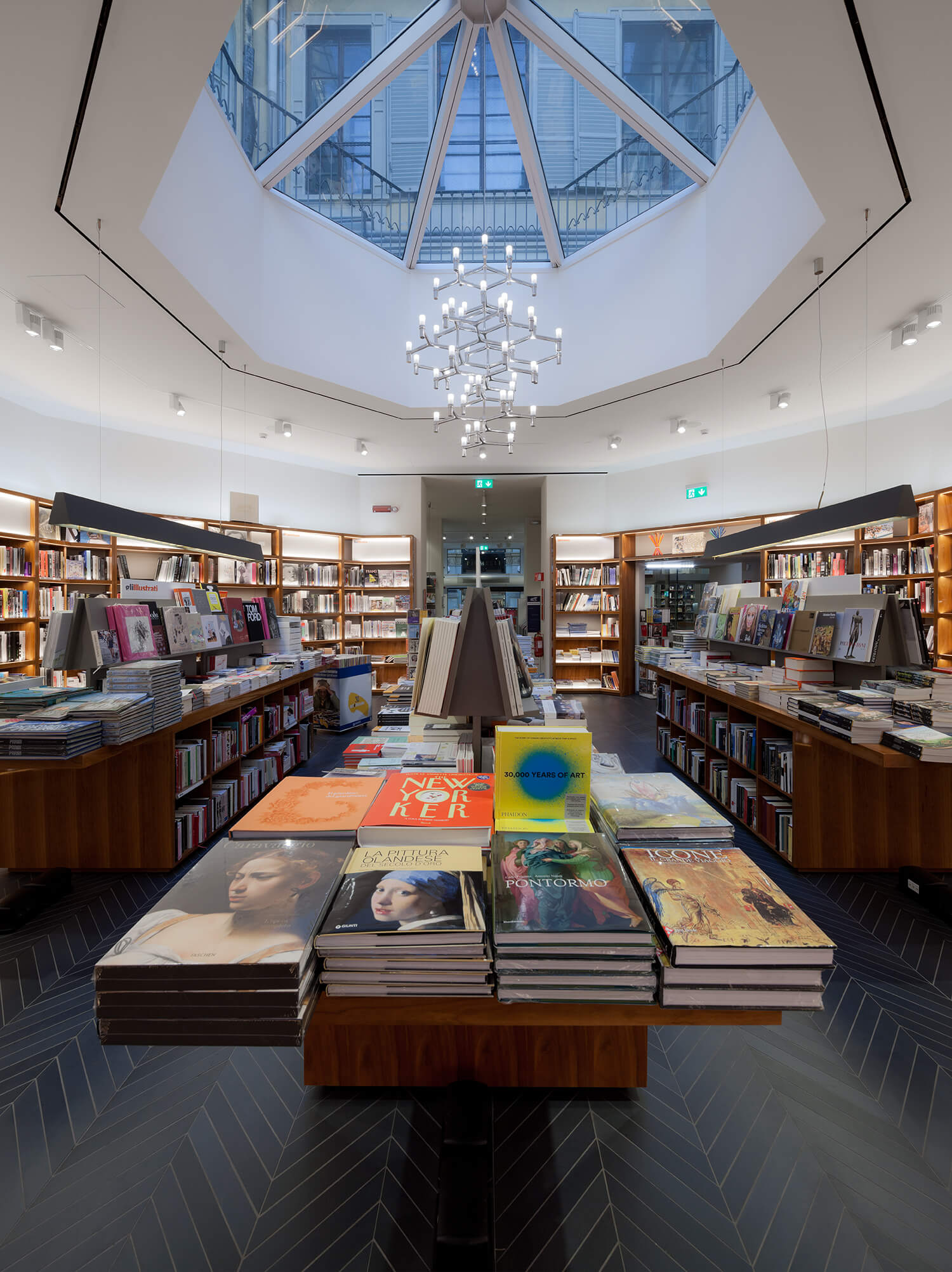
The real challenge and ambition of the project has been being able to see and tell the distinctiveness of the reading experience. Since the first draft, the attention to details has inspired most of the choices including new and old material suggestions.
The main steps have been the re-polishing of the “R” shaped brass handles, the finishing of the walls in a particular shade of white, recommended by the superintendent for the restoration of the plaster façade of the gallery.
The choice of the “blue ink” color for the ceramic flooring, laid according to the Chevron patterns of the French libraries, the American cherry wood furniture-bookcase of the Rizzoli Building on Fifth Avenue and West 57th Street in New York City, and more.
All the elements of the project have been inspired by nostalgia, quotes, and at the same time by new perspectives and contemporary scenarios.
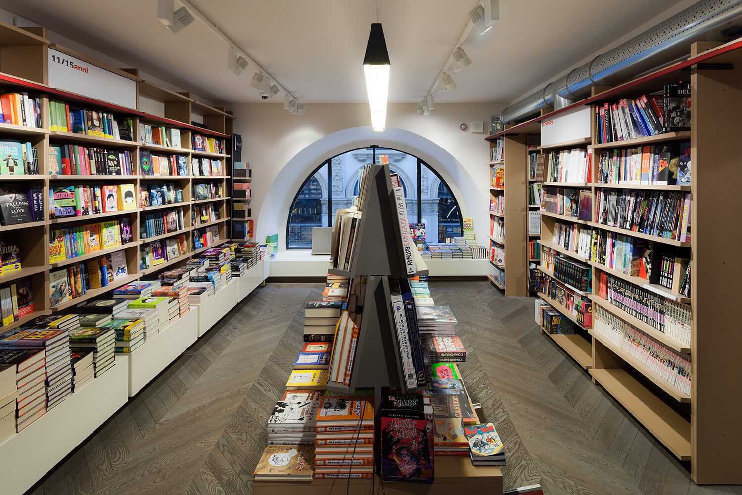
In addition to the intention of reinterpreting and enhancing the spatial relationships of the original building, the project includes an insert of new architecture consisting of a pedestrian scale and a lift, designed using the latest technologies in order to minimize the visibility of the structure and ensure a greater transparency using clearer glasses.
The core f the project, the al location of the space, consists of the vertical communication between the floors and of the vision of innovative perspectives whithin architercture. Furthermore, Rooms of the Book have been gateherd from architecture. In these Rooms a selection of books divided into thematic areas can be found, in order to let the readers discover the details and the values of the books properly.
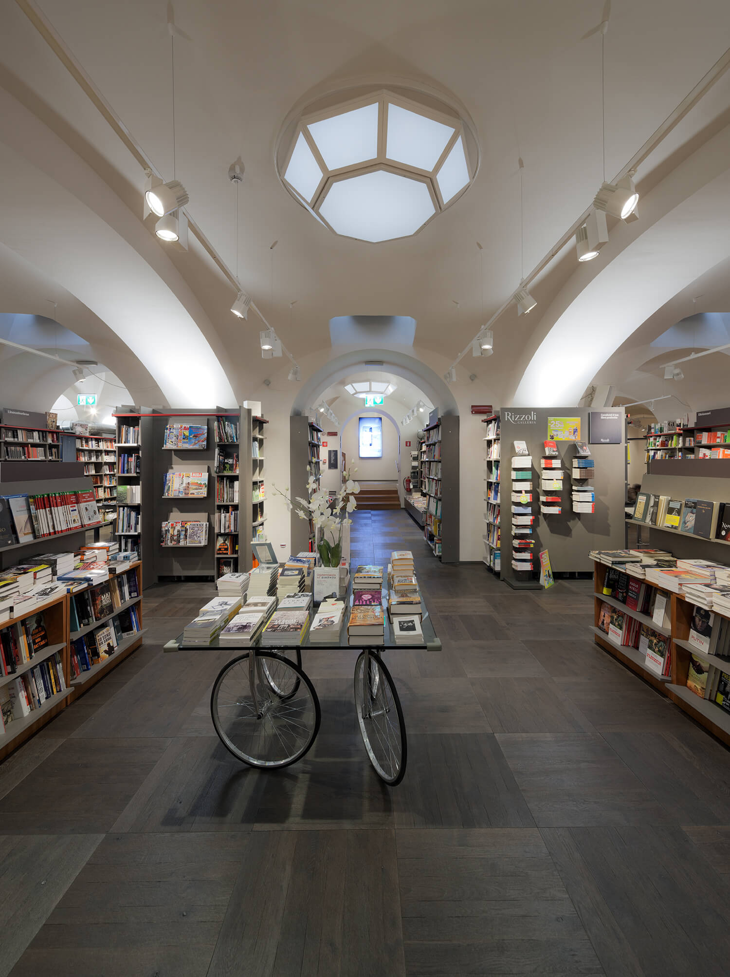
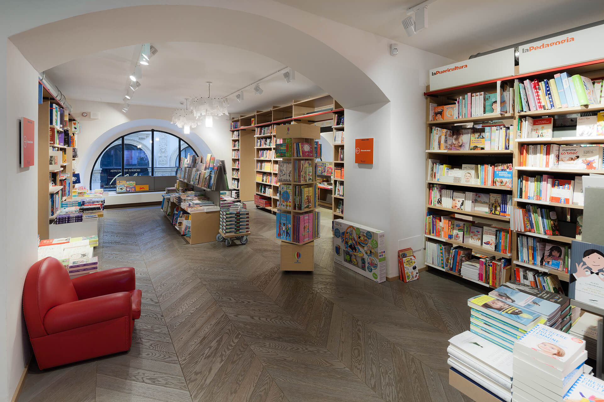
The modeling of the light has been particularly accurate in order to express the soul of the space and to highlight the expositive criteria of the Rooms of the Book. All of this has been made possible tank to the Viabizzuno’s and Ingo Maurer’s collections of lamps, and to the LED lamps by Reggiani.
The new furniture-bookcases have been inspired above all by a long and passionate work of research and by the real comparison with the secrets of the bookseller’s trade.
The bookseller is the central figure in a place where the human factor is the soul of relationships. It is a job which is rich in cultural competence and diplomatic capability, expressed through an absolutely un common talent to expose books with art. many technical solutions have been designed to allow booksellers to tell the editorial proposals in a wide range of exhibition modes. This variety can be found in the Rooms of the Book as well.
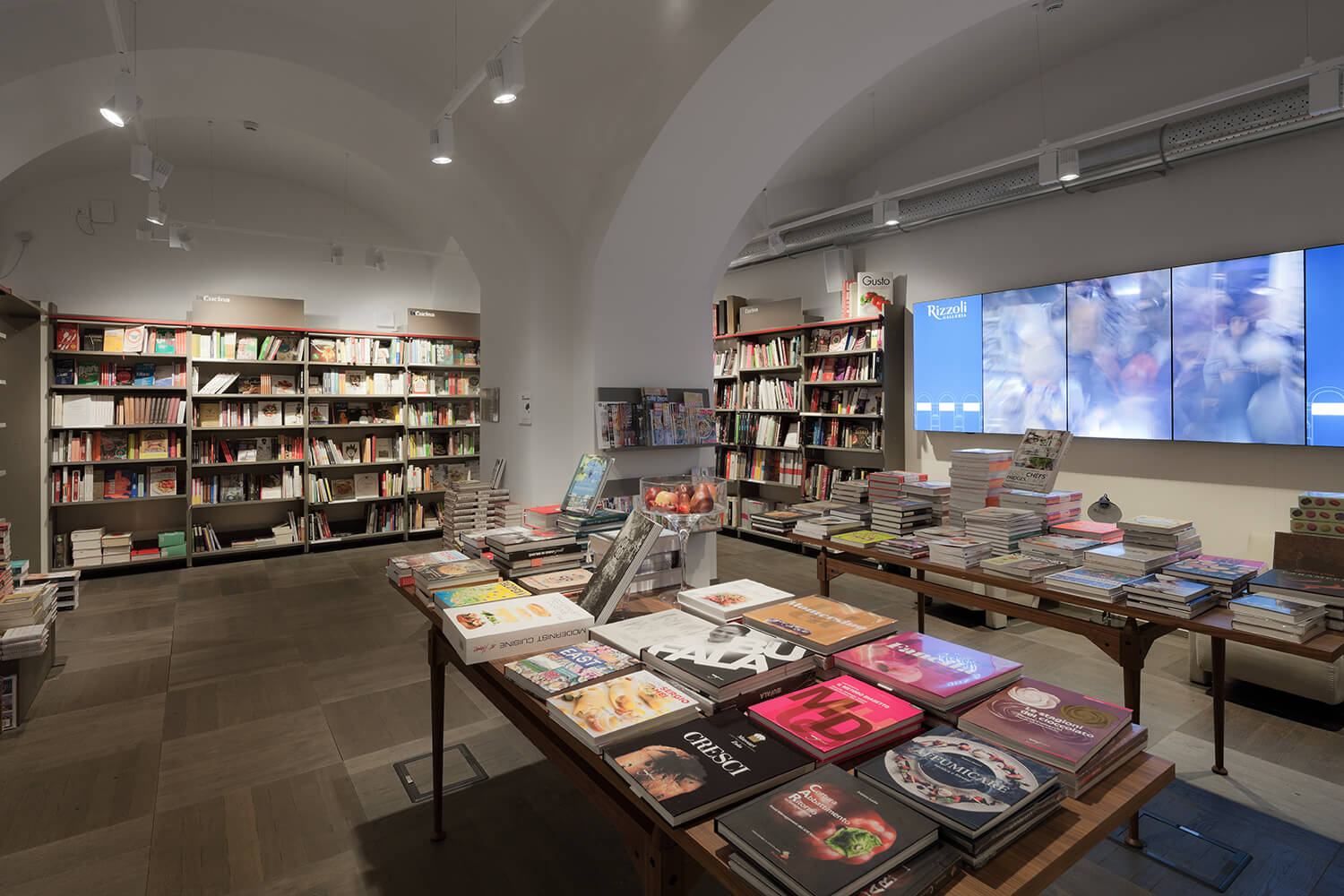
Images, words, texts, digital windows are carefully positioned within the space to accompany the experience of book lovers between information and new inspirations. There is also the possibility of using several reading stations, consultation tables and reading events.
For all these reasons, redesigning a bookstore cannot be just a stylistic exercise for an architect. Shielding places from the occasional transformation in order to consider them in their whole spectrum makes it possible to take a fresh look at the values of what surrounds us.
It also allows to imagine through the projects of public spaces, where bookshops belong to indeed, a new culture of knowledge, strongly supported by its roots.


